

The Challenge
Reposition a pharmaceutical and life sciences consulting firm through a complete visual rebrand. ViewScience operates at the intersection of regulatory affairs, scientific communication and market access — a complex, high-stakes world where credibility is everything. The existing identity no longer reflected the quality and authority of the firm's work. The challenge was to build a visual language capable of communicating scientific rigour, strategic expertise and modern professionalism, without losing the human dimension that makes ViewScience a genuine partner rather than just a supplier.
The Approach
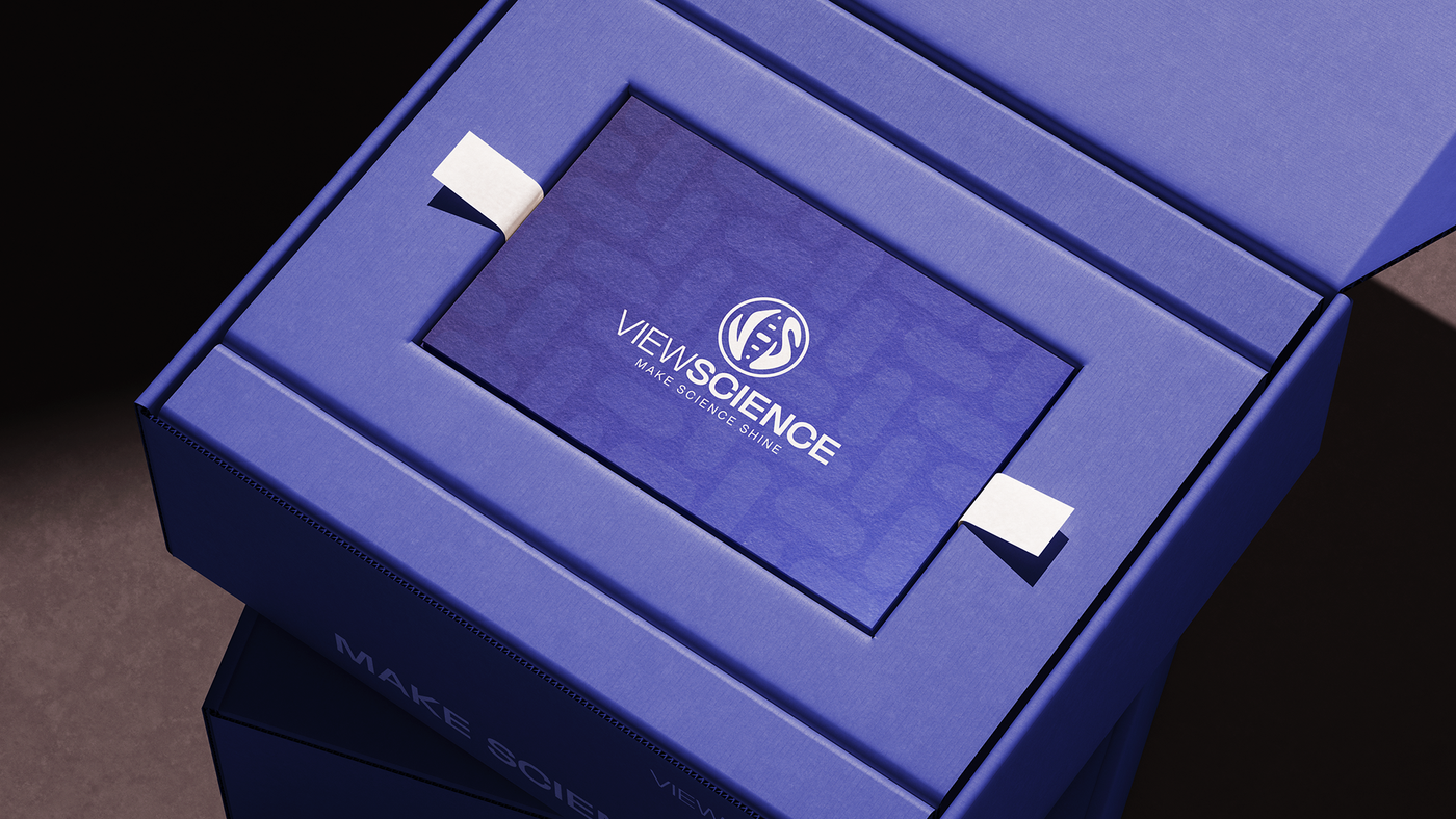
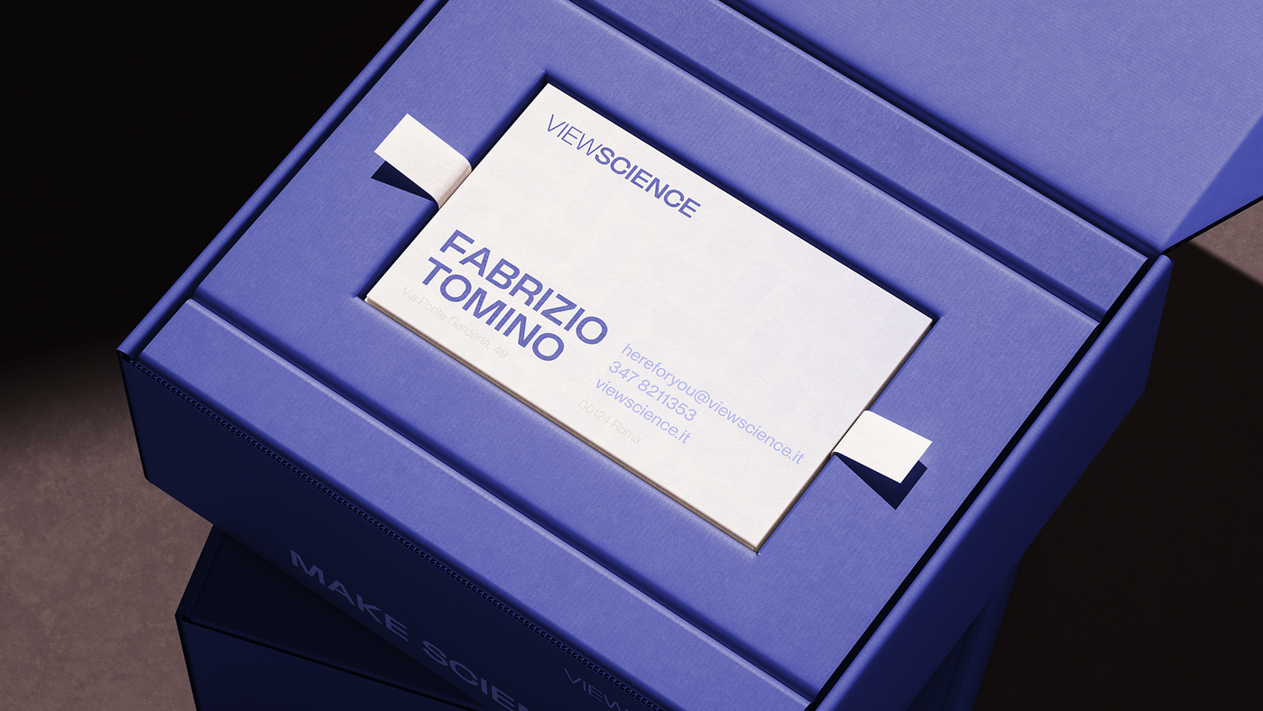
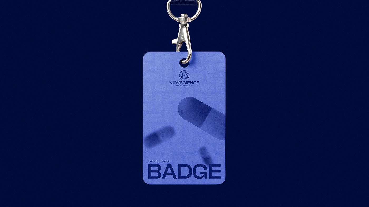
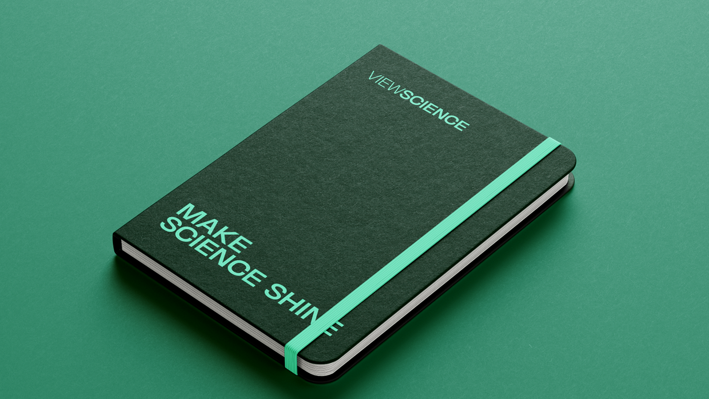
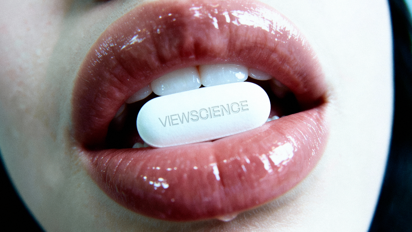
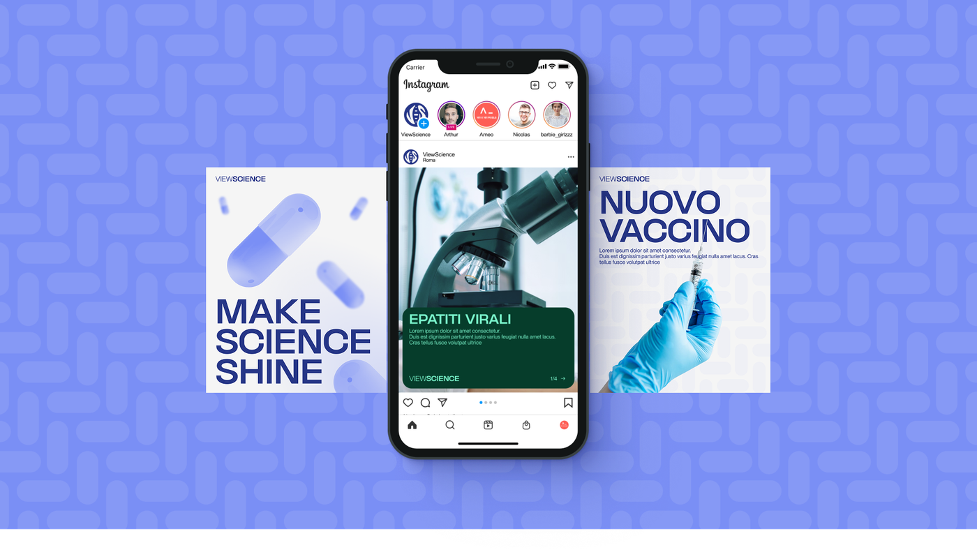
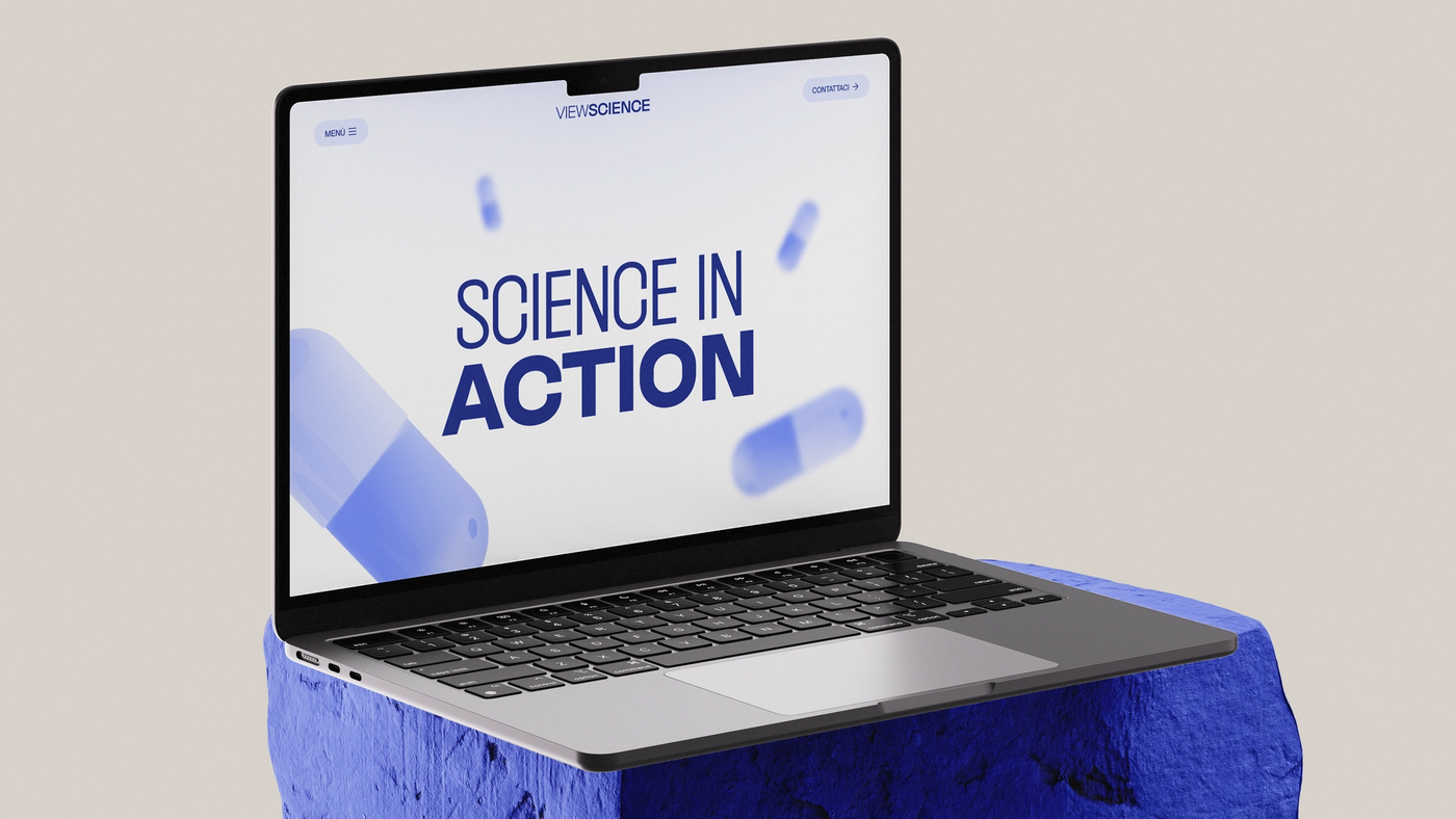
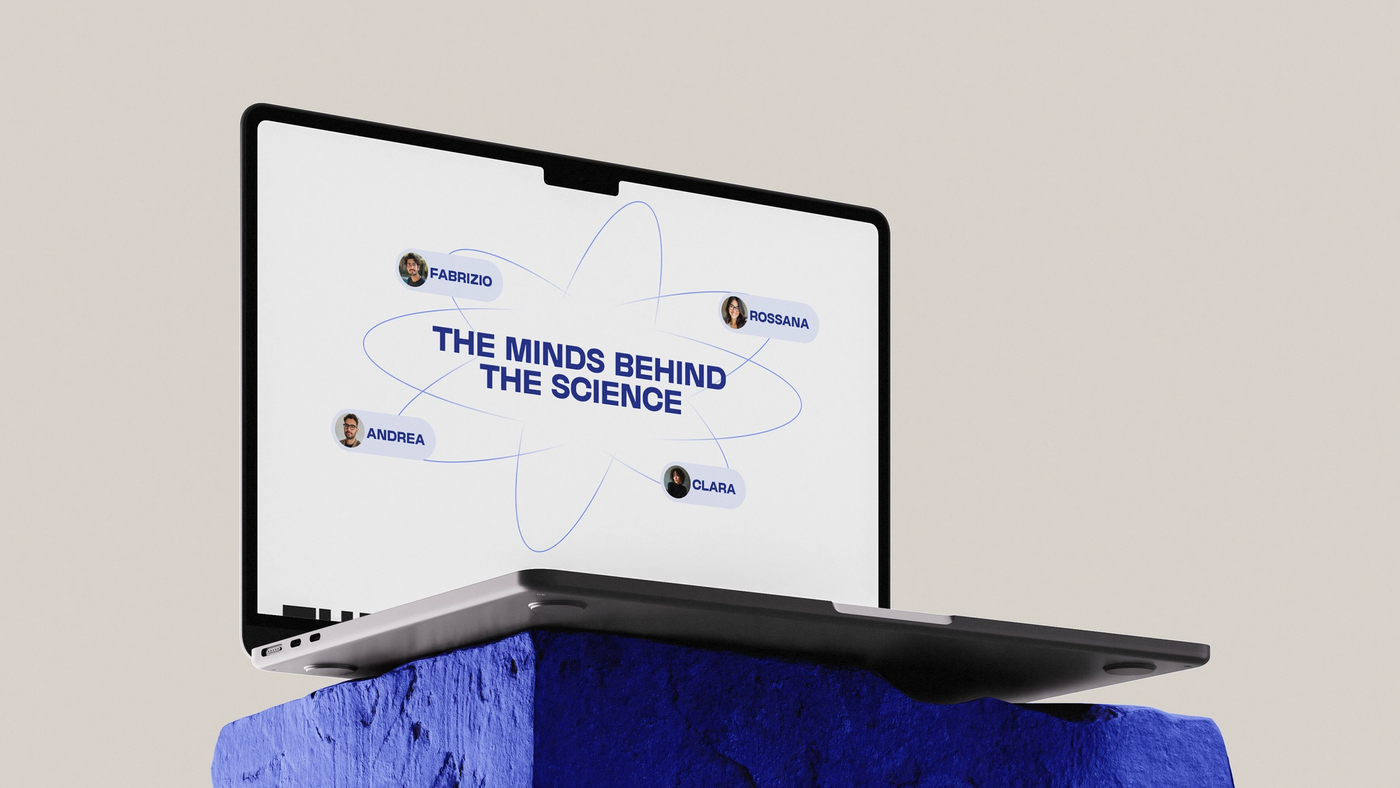
The rebranding started from the core concept embedded in the name: making science visible, clear, impactful. The new identity retains the DNA double helix at the heart of the mark — a symbol of life sciences — but refines and elevates it into a clean, confident pictogram. The typographic treatment shifts from the old serif-adjacent wordmark to a bold, authoritative sans-serif where "VIEW" and "SCIENCE" carry equal visual weight. The tagline "Make Science Shine" crystallises the brand's mission in three words. Beyond the logo, I developed a consistent visual system applied across digital and offline materials — presentations, brochures and scientific communication assets — adapting the language to the regulatory and communicative standards of the pharmaceutical sector.
The Solution
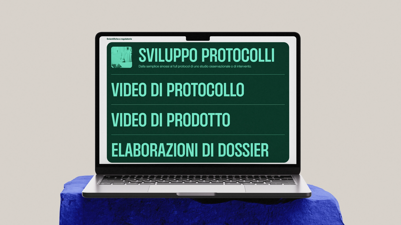
The result is a cohesive brand identity that positions ViewScience as a premium partner in the life sciences space. A visual system that is simultaneously rigorous and approachable, capable of working across scientific presentations for EMA submissions and commercial materials for market access teams. An identity that finally matches the calibre of the firm it represents.

Next Project
View All Works