The Challenge
To design the brand identity for a team of tourism professionals aiming to position Italy as a destination to be experienced authentically and sustainably. The challenge lay in creating a visual language capable of speaking to an international audience, standing out in the crowded travel market through an aesthetic that promises simplicity, human connection, and flawless organization.
The Approach
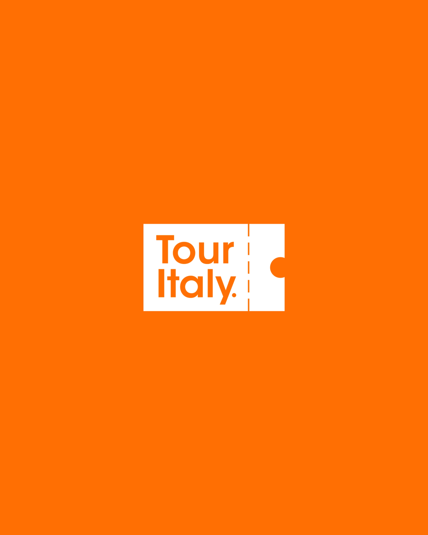
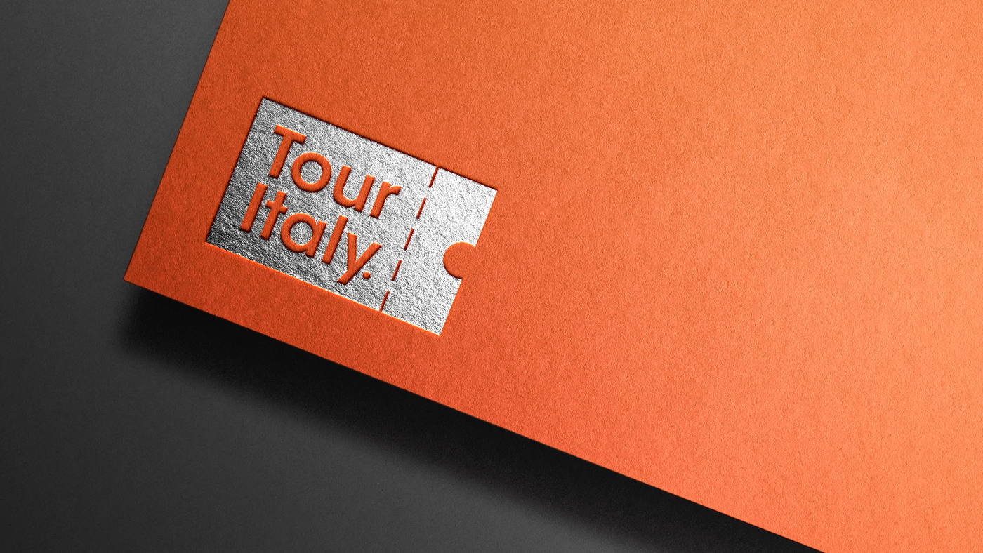
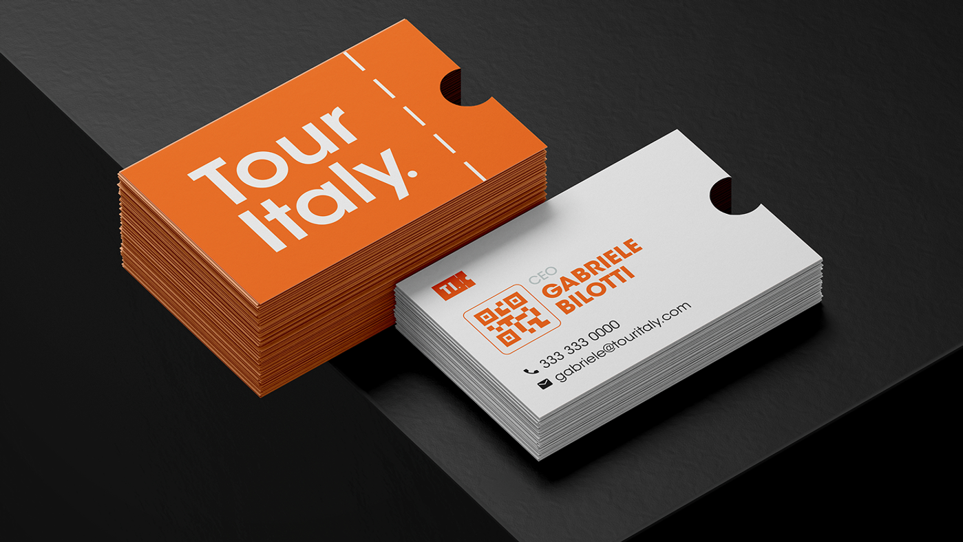
The brand design focused on the concept of "access." I developed a logo that transforms the iconography of a travel ticket into a modern, minimal symbol. The use of vibrant orange communicates energy, passion, and hospitality, while the clean typography ensures readability and authority. The creative approach was rooted in the brand’s manifesto: transforming travel from a mere movement into a memorable experience centered on stories and people.
The Solution
The result is a solid and flexible brand identity, applied to the touritalyonline.com platform. The brand now clearly communicates its dual soul: the logistical efficiency of a premier tour operator and the emotional spark of a passionate guide. Through this visual system, Tour Italy positions itself as the ideal travel companion for those seeking bespoke itineraries and a genuine connection with Italy’s millennial traditions.


Next Project
View All Works